Everbloom Collective
Retail
Branding
Brand Strategy
Melbourne
2024
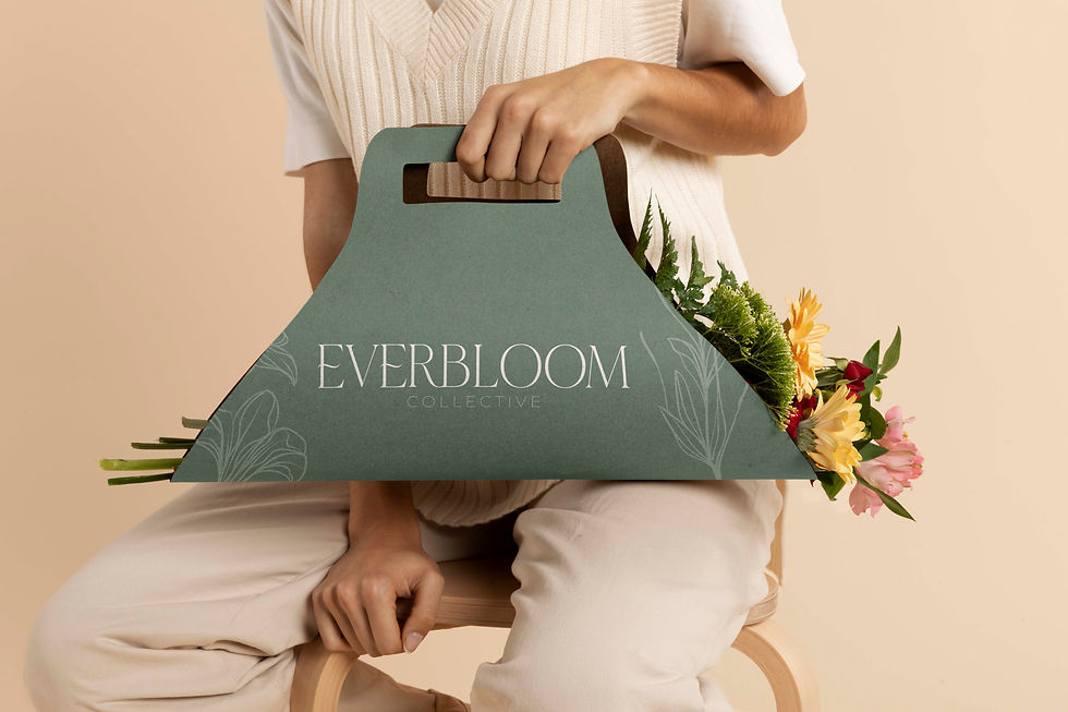
A full brand identity for Everbloom Collective, a sustainable floral studio merging luxury design with eco-friendly, everlasting blooms.
The goal was to craft a visual language that felt as timeless as the product itself: modern, organic, and grounded in natural beauty.
Summary
House of Tini was engaged to create Everbloom Collective’s full brand identity: logo suite, colour palette, typography, patterns, and brand direction.
Rooted in founder Courtney’s vision, the brand needed to express sophistication and authenticity, appealing to both wedding clients and event stylists seeking modern floral design with sustainable values.
The brand identity balances earthy textures and minimalist elegance, using soft greens, creams, and terracotta tones to reflect the organic-meets-luxury positioning. Each visual element, from logo flow to floral illustration, was designed to feel calm, refined, and enduring — much like the arrangements themselves.
Challenge
The challenge was to blend sustainability and luxury without leaning too far in either direction.
The brand had to speak to modern couples and design-led event planners who value aesthetics, but also sustainability and longevity — ensuring the concept of everlasting florals didn’t feel artificial or mass-produced.
Solutions
We built a brand identity that celebrates natural form and timeless design:
Developed a custom floral illustration to act as the brand’s signature mark — bold enough for scalability, soft enough to feel handcrafted.
Introduced a neutral, nature-inspired palette of Olive Grove, Terracotta, and Ivory Silk to convey organic warmth and elegance.
Paired Noto Serif and Montserrat typography for a balance of professionalism and softness.
Created brand patterns and icons inspired by blooming forms, reinforcing Everbloom’s story of growth, artistry, and renewal.